January 15, 2026
The Most Common Website Mistakes That Cost Businesses Leads
7 Mins
Many businesses invest in a website expecting it to generate leads or sales.
Instead, they end up with a site that looks fine—but doesn’t perform.
The problem usually isn’t traffic, pricing, or even demand. More often, it’s a handful of common website mistakes that quietly stop visitors from taking action.
These issues affect service-based businesses and e-commerce stores alike, and they often go unnoticed because the website “seems fine” on the surface.
Here are the most common mistakes we see costing businesses real leads and revenue in 2026.
Visitors should immediately understand:
When messaging is vague or overly clever, visitors don’t stick around long enough to figure it out.
A visitor lands on a professional services site but can’t quickly tell:
They leave and choose a competitor with clearer messaging.
A shopper lands on a store homepage but doesn’t immediately understand:
They bounce before browsing products.
Every page should guide visitors toward one primary action.
When websites include:
Visitors hesitate—and hesitation kills conversions.
A service page explains offerings well but never clearly prompts:
Interest fades without action.
Product pages fail to emphasize:
Shoppers pause, second-guess, and abandon.
Most users will view your website on a phone first.
If your site:
You’re losing conversions automatically.
A potential client tries to fill out a contact form on their phone but gets frustrated and gives up.
A shopper browses products comfortably but abandons checkout because it’s difficult to use on mobile.
Speed impacts:
Even a delay of a few seconds can dramatically reduce engagement.
A landing page takes too long to load, and visitors leave before seeing the offer.
Slow product pages or checkout flows increase bounce rates and cart abandonment.
People don’t convert unless they feel confident.
Common trust gaps include:
A visitor is interested but doesn’t see proof that others trust you—so they hesitate to reach out.
A shopper reaches checkout but doesn’t see:
They abandon the purchase.
More design does not equal better results.
Websites that are:
Make it harder for visitors to focus on what matters.
A homepage looks impressive but feels confusing. Visitors don’t know where to look or what to do.
Product pages are overloaded with tabs, popups, and distractions that interrupt the buying process.
A website should guide visitors—not just inform them.
When websites focus only on information without intention, conversions suffer.
The site explains services in detail but never guides users toward contacting the business.
The store lists products but doesn’t:
Information alone doesn’t convert.
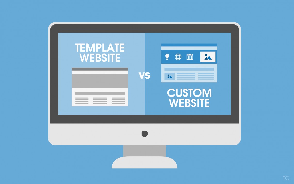
Templates can be useful—but only when customized properly.
Problems arise when websites:
A template site blends in with every other business in the same industry.
A store uses default layouts that don’t support the product type, pricing strategy, or buying behavior.
Business owners are too close to their own websites.
What feels clear to you may be confusing to a first-time visitor.
The owner knows the value—but visitors don’t understand it quickly enough.
The store owner understands the product—but new shoppers feel uncertain or overwhelmed.
This is one of the most common—and fixable—mistakes.
Individually, these issues may seem small.
Together, they:
That’s why many businesses say:
“Our website looks fine, but it’s not working.”
At Social Reach, we approach websites as conversion tools, not just design projects.
We focus on:
Every decision is made to help visitors take action.
If you want an honest, no-pressure way to evaluate your website, start with our free 5-Second Test.
It’s a quick UI assessment that shows whether your website clearly communicates value and encourages action within the first few seconds.
👉 Take the free 5-Second Test to see how your website performs from a real visitor’s perspective.
Most websites don’t fail because the business is bad.
They fail because the website creates friction instead of clarity.
Fixing these common mistakes can dramatically improve:
If you want a website that works as hard as you do, Social Reach is here to help.
Schedule a call with us to discuss what you need to grow